Two decades and four projects later, unshakable faith in a
vision leads to a house’s ULTIMATE CONVERSION.
RIGHT Before, a suburban ranch with standard-fare picture window and applied brick face. | ABOVE The addition of a garage wing and the relocation of the front entry began a series of four projects that revamped every inch of this house. The coral-colored wood shakes and dark turquoise accents set the tone for the rest of the house.
1
2
3
4

Additions & Alterations

Focus |
Whole House

Ultimate Conversion

With a consistent approach,
a whole house makeover
can be done well
in stages.

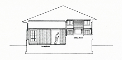
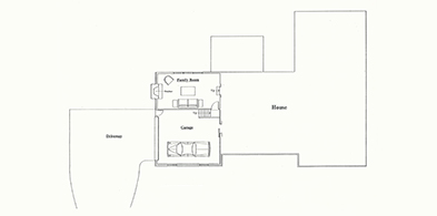
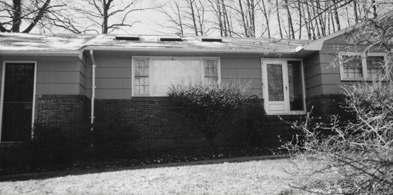
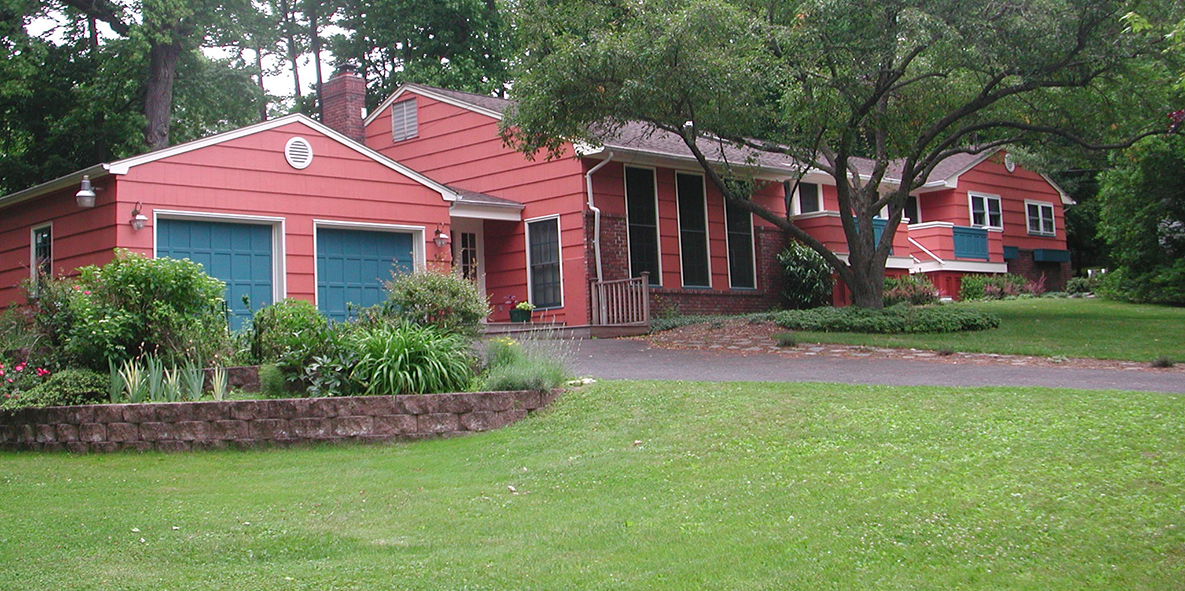
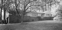
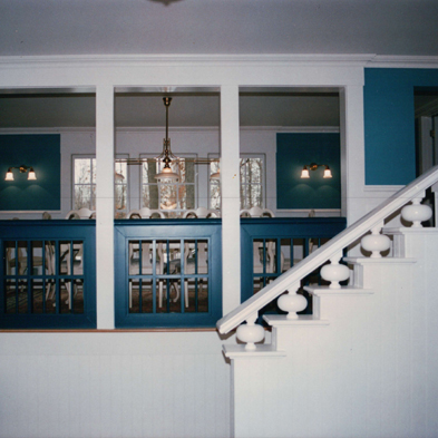
This family is living in their garage and, at one time, they took baths in their kitchen, figuratively speaking. So goes the story of switching and swapping and adding and subtracting rooms during a whole-house makeover that took place in four stages over twenty years.

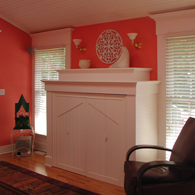
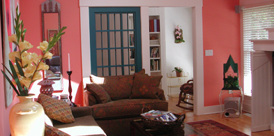
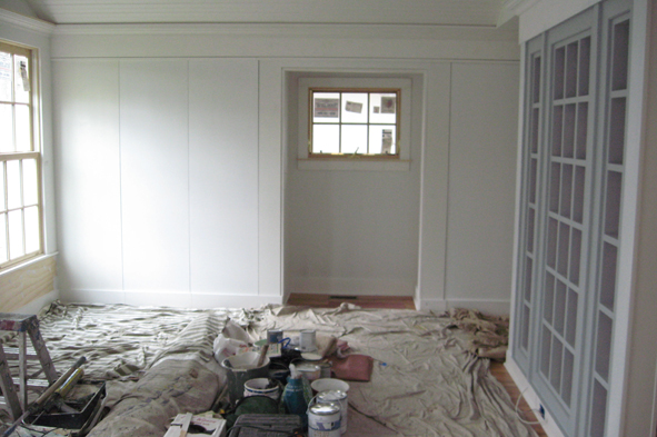
Of any, this project speaks to the changing needs of a family over time while speaking volumes about pacing home improvement projects in order to avoid renovator’s burnout. Although the project’s name originally referred to my initial work here: the 180 degree turnaround of serviceable garage into snug living room, it eventually came to refer to a stem-to-stern makeover.

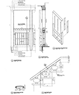
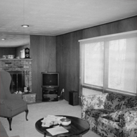
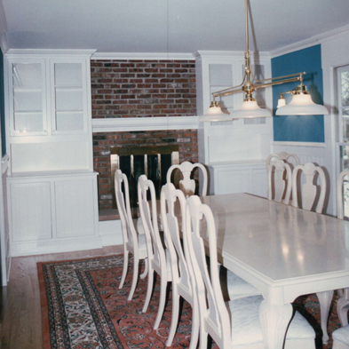
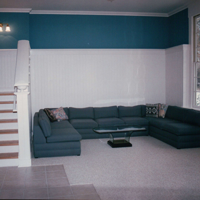
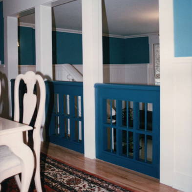
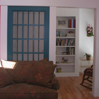
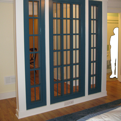
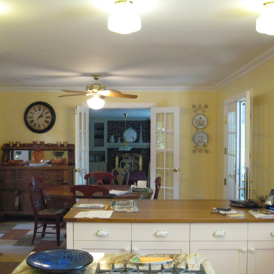
In order to convert the garage into a living room, I designed a new wing for a garage, entry foyer and powder room. My suggestion to forget about room names freed our minds to convert the family room into a dining room and reassign the living room to become a family room.

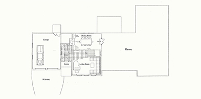
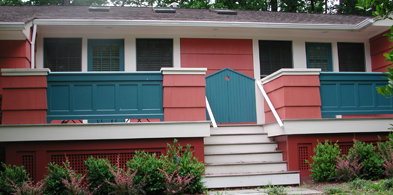
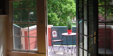
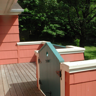
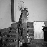
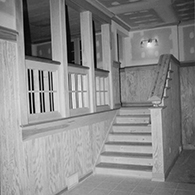
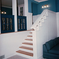
Later, a project I had proposed as part of a master plan came to be as a new deck across the front of the house that eliminated the former front stoop. As part of that second stage, I added architectural detail to the family room that occupied the space of the former living room.

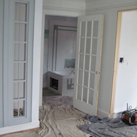
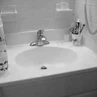
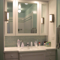
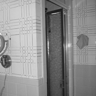
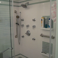
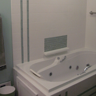
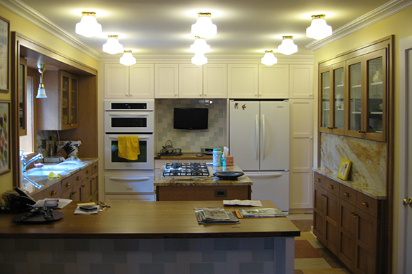
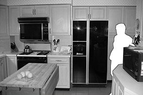
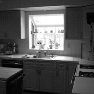
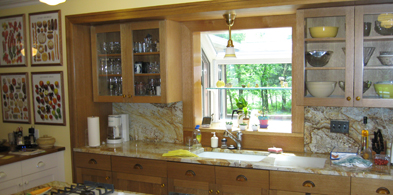
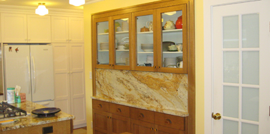
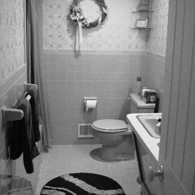
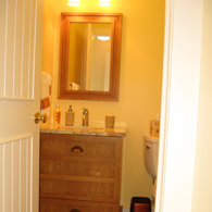
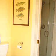
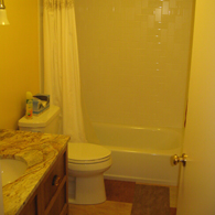
I was pleasantly surprised when, as stage three, the homeowners asked me to renovate the already renovated kitchen (see Sugar and Spice) along with a pair of ill-sized bathrooms. The allocation of a bathtub alcove to the kitchen allowed me to design better functioning and prettier rooms.

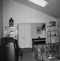
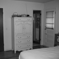
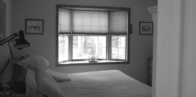
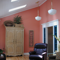
Finally, during stage four I combined two bedrooms to create a master suite with bigger bathroom and I improved the guest bedroom.

Years later, not a single room in this house remains unchanged.

1, 2 Before, the rickety steps could not have foretold of the wide new stair shown during construction. 3, 4 Plump melon-shaped balusters are in stark contrast against the gridded screens of the window sash-inspired railings between the dining and living rooms. 5 Explicit drawings provided details for building the railings.
5


Additions & Alterations

1
2
1 Before, the family room offered a better spot for a dining room. 2 Twin glass-fronted china cabinets flank the dressed up dining room fireplace. 3 Section drawing shows the fireplace in a dining room that overlooks the living room half a level down.
3
4
5
6
7
4 Before, the floor plan. 5 The new floor plan shows the garage wing with entry foyer and powder room. The dining room replaces the former family and the living room takes over the former garage. 6, 7 The former garage gave its high ceiling over to the living room.


Additions & Alterations

1
2
3
4
5
1 Before, the former front door was shunted into a corner. 2 The former front door and a picture window were replaced by a series of double hung windows and French doors. Railing panels match the garage doors. The circular cutout of peaked gates refers to the round vents on the house’s gables. 3 The family room opens onto a street facing deck. 4 The front deck has two distinct sections. The peaked gates provide a degree of security and some privacy. 5 The peaked profile of the deck gates is set into the doors of the family room’s custom television cabinet based on an historic stepped fireplace mantle. 6 Before, the family room offered space but no detail. 7 Before, the armoire needed more detailed surroundings. 8 The family room ceiling was paneled in bead board and the existing doorway was divided and trimmed out to coordinate with the dining room railings. 9 In the family room, a door-wide screen based on the dining room railings allows a view through to the paneled bookshelves of a reading nook.
6
7
8
9


Additions & Alterations

1
2
3
4
5
6
7
8
9
1 Before, narrow doors led into the tiny en suite bathroom and onto the back yard deck. 2 A painted French door leads into the enlarged en suite bathroom and a doorway leads to the deck. 3 Before, the master bedroom did not reflect the rest of the house. 4 Closets built to look like a wall offer as much storage as a nearby walk-in closet. The grids of the railings and the partial screens elsewhere in the house enjoy full expression in the big screen of the master bedroom.
5 Before, the cramped vanity. 6 A hutch-like vanity with three-way mirror. Corian countertop underscores iridescent tile backsplash. 7 Before, the tight stall shower. 8 Adjustable spray heads offer varied shower experiences. 9 A soaking tub occupies a corner.


Additions & Alterations

1
2
3

Now Playing on the Big Screen:

Designing a Family of Features to Give Relativity to a House
A series of intricate works of carpentry
guides a path through the house
that ends in a sharp final cut.

Did you ever notice how louvered window shutters filter light and cast shadows on the walls? Or how when you look through them, the louvers break up the view beyond into a mosaic of pieces that somehow seem more intriguing than the whole? Here, a series of screens designed as a sequential experience for those that roam through this house provides similar visual effects.

1 Gridded railings between the dining room and sunken living room were based on window sashes. 2 In the family room, full-height screens based on the dining room railings may first appear as sidelights. 3 A full-height version of the dining room railings allows a fragmented glimpse into the family room. | ABOVE The stair’s plump melon-shaped balusters are purposefully silhouetted against the grids of the dining room railings. 4 In the master suite, instead of walking up to or through the screen, you must walk around it: it is an object unto itself. 5 Before, at hall’s end, a wall was taken down to make way for a door to the master suite. 6 The large scale screen allows a discreet view into the bedroom.
4
5
6


LEFT Before, a store-bought rolling island situated in the middle of the kitchen floor provided the inspiration for a permanent and larger island in the renovated kitchen. | ABOVE The kitchen combines painted and stained cabinets in similar but not matching styles to suggest that the kitchen was outfitted over time. A light grid enlivens the ceiling. | INSET RIGHT Small scale basket weave pattern of earthy linoleum floor tile mocked up for approval.

Kitchens & Bathrooms

Focus |
Kitchen
Bathrooms

Sugar and Spice

With a little bit of this and little bit of that,
sweet and savory materials are mixed
in a kitchen and two bathrooms

The building of a proper kitchen is like putting a good meal on the table: assemble your ingredients, come up with a recipe and follow it. Simple, except that this analogy can fall flat around the dinner table when folks simply can’t concoct a hearty design from their shopping list of kitchen must-haves. That’s usually then I’m invited to come over and cook something up.

As a stopgap measure to increase the counter space their kitchen lacked, my longtime clients, now friends, placed a store-bought chopping block in the center of the room. With that, I was invited to discuss a permanent solution to their island dilemma. But after a litany of complaints about features other than the makeshift island, my friends realized that they needed to renovate their kitchen entirely.

They asked me to redesign their kitchen along with two adjacent bathrooms to complement my previous projects for them (see Ultimate Conversion). Gut instinct urged me to give the kitchen the appearance that it had evolved over time, allowing me once again to aspire to a Craftsman-style feel within a brighter contemporary setting.

Starting with a simple flat panel door design, I asked for the bulk of the cabinets to be built in quarter-sawn oak with its figural grain. I stained it a befitting color: nutmeg, the spice. I asked for the rest of the cabinets to be built out of smooth-grain wood so that it could be painted to match the rest of the house: white, and hence, the sugar.

I suggested complementary glass knobs and pulls that are the same and yet different: the simple white ones are smooth and the fancy amber ones are fluted. The rigorous basket weave pattern of earthy linoleum tiles on the floor contrasts with the similarly-toned irregular pattern of the granite of the counter tops and backsplashes.

Light and dark. Plain and fancy. Sugar and spice and everything nice mix contrasting materials to make a visually tasty kitchen.


Kitchens & Bathrooms

1
2
3
4
5
1 Before, the existing greenhouse window was retained. 2 Before, base cabinets were removed to make way for the island. 3 The alcove containing the cabinetry for the sink is lined and trimmed in rift cut oak. Counter tops and backsplash are granite. 4 Existing wall cabinets were refaced and false-front cabinets were installed below to balance them out. 5 A peninsula divides the cooking area from the breakfast area. Dining room beyond.
6 The outdated bathroom was reduced in size to give more room to the kitchen. The remainder of the space was divided between a powder room and another full bathroom. 7 The powder room vanity and mirrored medicine cabinet are similar to but do not match the oak cabinets in the kitchen. 8 A shower room adjacent to the powder room has another door from the hall so that it can be used on its own. 9 A standard size full bathroom with bath tub replaces its much smaller predecessor.
6
7
8
9